New item styles for List listing, Grid listing, and Carousel widgets
Four new item styles are available: 2 for List listings and 2 for Grid listing and Carousel widgets.
List listing:
- Row with separator - No Image
- Row without separator - No Image
Grid listing:
- Tile Landscape - Square Image
- Tile Landscape - No Image
New List listing display styles
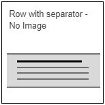
Row with separator - No Image thumbnail
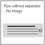
Row without separator - No Image thumbnail
Currently the Row with/without separator - Square Image and Row with/without separator - Portrait Image styles display a listing image if the content represented by the listing item has a listing image. An image is not displayed in the listing item if no listing image is present.
The Row with separator – No Image and Row without separator – No Image style allow listing items to be displayed without an image, even if the listed content has a listing image.
New Grid listing and Carousel display styles
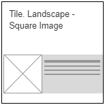
Tile Landscape - Square Image thumbnail
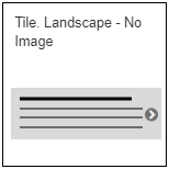
Tile Landscape - No Image thumbnail
These item styles are intended to be concise, space-efficient, and useful when you want to be able to show many items at a time. They are intended to be used in Grid listings and Carousels and be used two, three, four or six per row.
The minimum height of the ‘Square image’ item style is 128px, as governed by the size of the image; the minimum height of the ‘No image’ item style is 48px. The maximum height is governed by the size and quantity of text it contains.
Field allocation
A maximum of four rows of text can be configured to display. The text that is displayed depends on the type of content that the listing item depicts. The table below illustrates how the text fields appear across the four content types.
| |
Page |
Article |
Event |
Person |
| First row |
Title |
Title |
Title |
Title |
| Second row |
Listing text |
Publish date |
Event date then location, separated by a comma if both are present |
Job title then affiliation, separated by a comma if both are present |
| Third row |
Tertiary text |
Listing text |
Listing text |
Listing text |
| Fourth row |
n/a |
Tertiary text |
Tertiary text |
Tertiary text |
Field display configuration
Two new configuration options exist for the Tile Landscape styles: It is possible to choose whether or not to display the Listing text, and the Tertiary text fields in the listing.
Whether these text fields display can be set using checkboxes in the Layout options section of the Grid listing and Carousel editing screens:
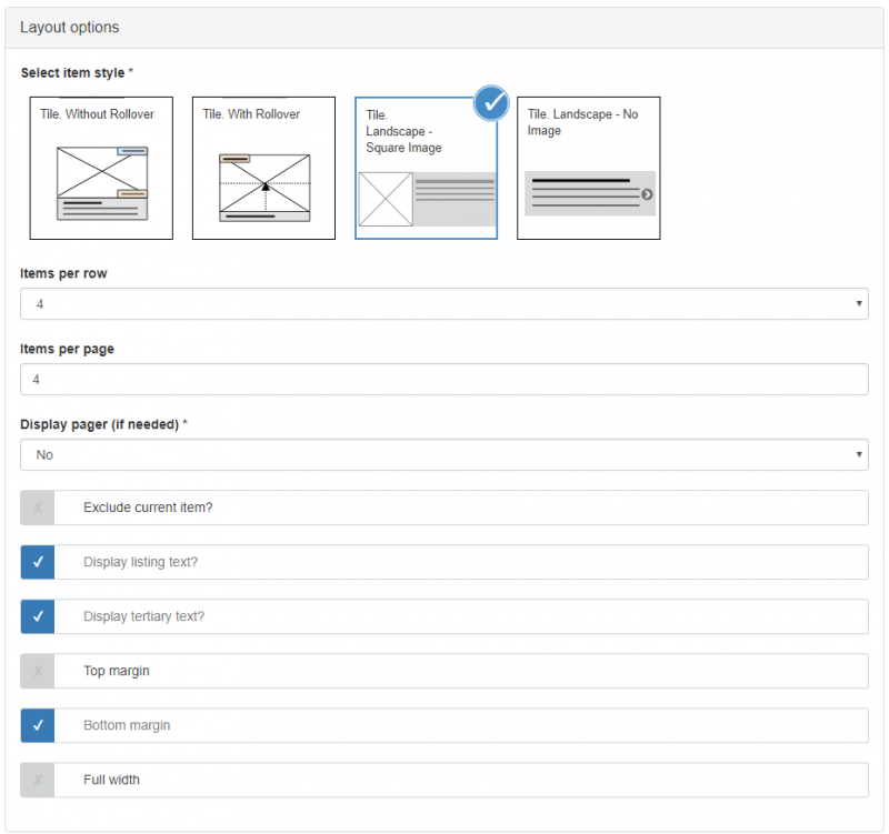
Tile Landscape - Layout options: Display Listing/Tertiary text checkboxes ticked
Font configuration
The font settings for the Tile Landscape styles are in Advanced Font Management > Item styles > Tile – Landscape:
- Title
- Metadata
- Listing text
- Tertiary text
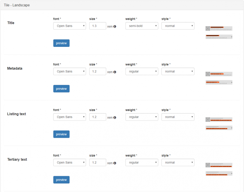
Tile Landscape font configuration options
Colour configuration
The colour settings for the Tile Landscape styles are in Advanced Colour management > Item styles > Tile – Landscape:
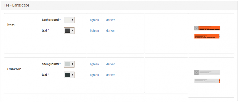
Tile Landscape colour configuration options