Grid listing

User level: Site Owner; Site Administrator; Site Editor; Site Author; Site Contributor


The Grid listing widget is for laying out a set of items which link to other pages. A selection of pre-built 'item styles' and a set of configuration options can be used to define the appearance of the set of links.

Screenshot of edit form for Grid listing widget

[1] Title and Link

widget title and link configuration

Title (optional): input a widget title

Link (optional): create a link to appear at the top-right of the widget

  • Title: provides the link text
  • URL: internal URLs should be inputted using the alias of the page to be linked to, in the format: '/page-alias'; external URLs should be inputted using the full URL, including 'https://'
  • 'Open URL in a New Window' checkbox: when set, clicking the link opens the URL in a new browser tab

[2] Content source selection

Content filtering allows Grid listing, List listing, Carousel, and Slideshow advanced widgets to display items automatically based on Content type and subtype, associated Taxonomy terms, or a combination of these.
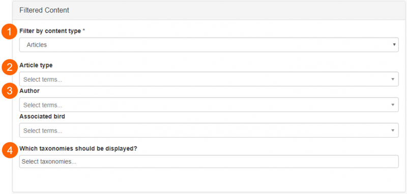
filtered content source - content type selected
  • Filter by content type (1). Pages belonging to the selected content type will be displayed in the listing
  • Filter by content sub-type (visible once content type is selected) (2). Pages belonging to the selected content subtype will be displayed in the listing
  • Taxonomies associated with the selected content type (3). Pages with the selected taxonomy terms associated with them will be displayed in the listing. One term can be selected per taxonomy
  • Choose to display taxonomy filters to end users (4). Taxonomy filters can be displayed to end users (e.g. below), for them to use the listed pages' associated taxonomy terms to filter for topics of interest
taxonomy filters example

Output on a Mosaic site: Taxonomy filters displayed above a Grid listing


If you insert a listing widget on an Events page, for example, and select Filtered as the content source, you have the option to exclude the Events page which will host the listing widget from the displayed items. Select the check-box called Exclude current item:

Screenshot of edit widget showing filtered content option checkbox to exclude current item

Sorting options

The order of items displayed in widgets using the Filtered content source can be managed using the Sorting options.
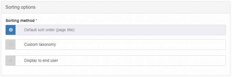
sorting options

Sorting options for Filtered content

Default sort order and displaying sort order to end users

Default sort order sorts the items in the widget alphanumerically according to: page title (for Page content); publication date (for Article content); event date (for Event content); sort name (for Person content).

The 'Display to end user' checkbox controls the display of a dropdown filter to users. When enabled, the filter can be used to toggle the default sort order between ascending and descending order.

display sort order to end user filter

Output on a Mosaic site: Default sort order displayed to end user

Sorting by custom taxonomy

If taxonomy terms are applied to content listed in the widget, and Custom Taxonomy is selected as the sorting option, the items will be sorted by alphanumerical order of the taxonomy terms.  Pages without custom taxonomy terms will have their listing items shown at the end of the list.

Note: If you manually change the order of a custom taxonomy then that will not impact the sorting.  Hence custom taxonomies that are created for the purpose of ordering the items in listings need to use prefixes like A, B, C on the terms to make them order correctly.  

Promoted items

The layout of filtered content can be changed to 'promote' specific items or types of item; these featured items will appear twice the width of normal items. See below (under 'Layout options') for details.

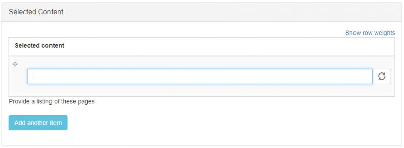
  1. Type the title of the page you want to list into the text input field
    selected content input field
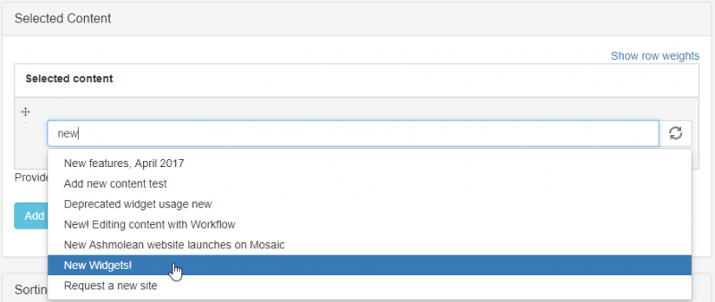
  2. The autocomplete process will display all pages matching the input text in a dropdown list
    selected content input example
  3. Select the page you want from the dropdown list
  4. To add another page to the listing, click 'Add another item' to display a new text input field

Distinguish between duplicate page titles

Because the dropdown list displays pages' titles only, it can be difficult to distinguish between pages with the same or similar titles. When one of the pages is selected, the page's 'node ID' is displayed in parentheses after the page tile. Each page has a unique node ID which can be used to distinguish pages. To find a page's node ID:

  1. go to Manage Content > Content tab
  2. use the Title text field to filter for the page title
  3. hover your cursor over the 'Edit' button for the page (1)
    finding a page's node ID
  4. in the bottom-left corner of the browser window the link to the editing area for the page will appear. This contains the text 'node/[number]' (2). The [number] element is the page's node ID

Change the order of selected listing items

To reorder pages displayed in the listing:

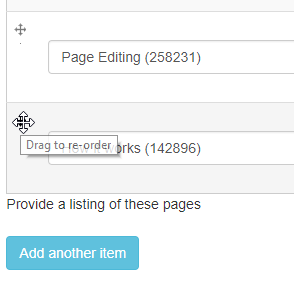
  • use the multi-directional arrow within the listing item to drag-and-drop it into a new position in the listing order:
    reordering selected content items

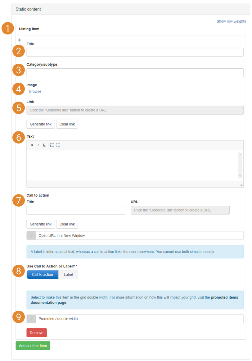
Static content allows you to create each item in a Grid listing, List listing, Slideshow (advanced), Carousel, or Banner from scratch. The static content interface (below) lets you build each item by supplying text, images, and URLs. This method of populating widgets allows external URLs to be used.

static content interface
  1. Listing item configuration options
  2. Static item title. This text will be output in the 'Title' text region of the item style that is used
  3. Category/subtype. The content subtype of pages displayed in Filtered and Selected listings can be optionally exposed (depending on the item style used). The Static content source features a 'Category/subtype' field which mimics the exposed subtypes of Filtered and Selected content listings
  4. Image. The image will be displayed in the selected item style, if the item style includes an image field. See the widgets documentation for information about the item styles available to each widget. See the Mosaic Pattern Book for examples of item styles in use
  5. Link. Add a URL to the item. This can be to a page or file on your site or an external URL
  6. Text. This text is output in the 'listing text' region of the item style
  7. Call to action. Some item styles support the addition of Call to Actions/Labels
  8. Use Call to action or Label? Display the Call to Action as a clickable Call to Action (using the supplied URL) or as a Label (no link is created; the Label can be used for promotion of the item)
  9. Promoted / Double width. (For Grid listing items only) choose whether the Grid listing item occupies twice the width of a normal grid item to make it more prominent to your website's visitors

For details of how to output RSS feed content in listing widgets, see the Feeds documentation.

[3] Widget layout

Content to come

This option only applies to filtered content in a grid.

When an item is ‘promoted’ this means it will be given twice as much width as a normal item in the grid. In the example below, this is a 4-per-row grid, with two featured items.

How to promote items in a grid

Static grids

On each item you add to a static grid, there is a ‘Promoted / double width’ checkbox. Select this on any items you want to be double width in the grid.

Filtered or Selected grids

Ensure that every item you want to be promoted in the grid has a taxonomy term in common, which is not shared by any items that should not be promoted. Type this taxonomy term into the ‘Promote items matching this term’ field. It must be an exact match, although differences in capitalisation will not make a difference. Any content item in your grid that has been given that taxonomy term will now display as double width.

Feeds

It is not possible to use promoted items if your content source is Feeds.

Other notes for this functionality

Mobile

Items will not be promoted when viewed on a mobile device, in order to preserve screen space.

Other Widgets

This functionality is only available in grid widgets.

Sort Order

In some circumstances, making items in your grid double width can modify the sort order. If, for example, we start with a 4-per-row grid, with a distinct sort order as follows:


If items 2 and 7 were ‘promoted’, they would become double width. As item 7 now cannot fit on the second row of the grid, there would logically be an empty space, as it would be forced to the third row:


Instead, the next non-featured item will slot into the available space, so the aesthetic of the grid is preserved, even if this results in a slight re-ordering. If the sort order of your grid is extremely important, it is advised that you do not use promoted items in your grid.

grid listing widget