Images

User level: Site Owner; Site Administrator; Editor; Author; Contributor

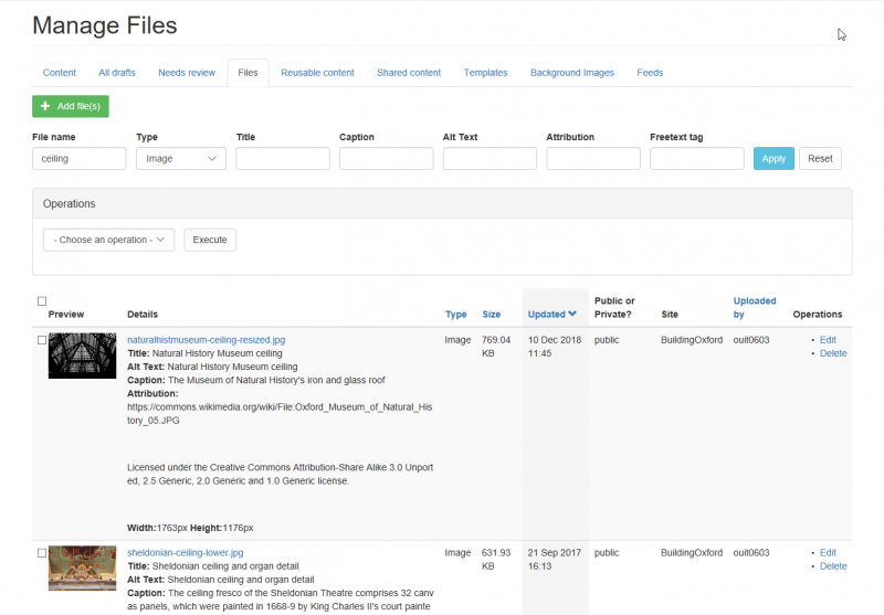
media library images


If you're looking for information about uploading files to your site, see the Files documentation

Expand All

Image dimensions in layout widgets

The five 'layout' widgets (Banner; Slideshow advanced; List; Grid; Carousel) use item styles which contain images. The size of the images vary between item styles and depending on how the widget is configured (e.g. the number of listing items per row; the width of the page region the widget is in).

Optimum dimensions for uploading images

Images that are too small for use in the intended item style will appear pixelated when the page is rendered.

Images that are much larger than the maximum image dimensions of the item style will likely be a larger file size than is required and will therefore needlessly use potentially chargeable disk space.

Below is a guide to the maximum dimensions of images displayed in layout widget item styles.

The guide includes recommended maximum dimensions for images that are uploaded for use in the various item styles. The recommended maximum dimensions assume the image is being used in an item style which is displaying the image at maximum size. However, if the item style is displaying the image at a much reduced size (e.g. because the item is in a narrow page region, or is in a Grid listing with several items per row), it may be possible to upload an image under the recommended maximum dimensions without it being pixelated when rendered.

Banner, Slideshow, List item style image dimensions

Item style Maximum displayed image dimensions Recommended max. uploaded image dimensions
Landscape styles    

Landscape Text Bottom Centre

1728px x 520px 1728px x 520px

Landscape Bottom Left

1728px x 640px 1728px x 640px

Landscape Centre Left

1728px x 520px 1728px x 520px

Landscape Centre Right

1728px x 520px 1728px x 520px
Breaker styles    

Breaker Text Centre Bottom

1728px x 576px 1728px x 576px

Breaker With Image

1728px x 520px 1728px x 520px
Image Text styles    

Image Text 75/25

1293px x 570px 1293px x 570px
Row    

Row with Separator - Square Image

128px x 128px 256px x 256px

Row with Separator - Portrait Image

128px x 160px 256px x 320px

Row without Separator - Square Image

128px x 128px 256px x 256px

Row without Separator - Portrait Image

128px x 160px 256px x 320px

Grid and Carousel item style image dimensions

Item style Maximum displayed image dimensions Recommended max. uploaded image dimensions
Tile item styles    

Tile. Portrait without Rollover

856px x 640px 1284px x 960px

Tile. Portrait with Rollover*

856px x 512px 1284px x 768px

Tile. Landscape Square Image

128px x 128px 256px x 256px

Tile. Landscape 50/50

600px x 660px 900px x 990px

Card item styles


Card with Icon image

64px x 64px 128px x 128px

Card with Banner image

780px x 520px 780px x 520px

*guidance for aligning images with the viewport for the Tile. Portrait with Rollover style is given in the section about Image Cropping and Reframing below

Understanding how Mosaic crops and re-frames images is useful to understand which type and size of image will work best on your website.

Cropping

When an editor selects an item style for using with a Grid, List, Carousel etc., Mosaic makes a crop of the List Images of the content included in the widget, taken from the original images uploaded into the media library. The crop is nearly always landscape and will aim to centre the cropped image over the crosshair the editor set on the image when uploading it. The exact size depends on the item style selected.

How well this looks on your page depends on:

  • whether the original image was portrait or landscape
  • how big the original image is in relation to the crop size
  • where the crosshair was set

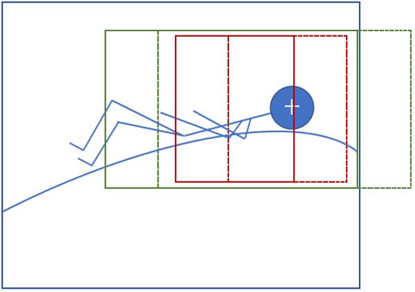
The closer the crosshair is to the edge of the image, the worse the result is likely to be. This is because the crop can't put the crosshair in the centre of the cropped image, if part of it would then have to fall outside the edge of the original image (see Fig. 2 below).

Re-framing

It is often a user-configurable option to decide how many items per row to include in a Grid or Carousel, or to choose to put a List in a narrow or wide region of a page. Mosaic therefore has to be able to resize the item images to fit all of these uses, whether the editor selects 2 items per row or 6, or uses a wide or narrow region. This means the width of the image can be very different in different widget items: sometimes it may be landscape, but it can often be portrait - as for many items per row or in narrow regions.

Mosaic also provides versions of the image for responsive use: i.e. the same items in the same list will show images of different aspect ratios depending on whether it is viewed on a desktop, tablet or smartphone.

The way it does this is to re-frame the cropped image using an appropriate aspect ratio for the selected options/context to show only the part of the image within the frame. It makes the frame on the basis of the centre of the cropped image.


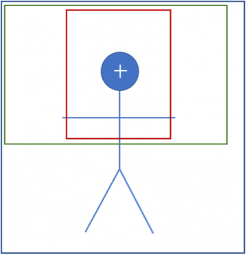
illustration of portrait image cropping and framing

Fig. 1 Portrait image


Key:

Blue box = original portrait image

Green box = cropped with crosshair in the centre

Red box = portrait frame in centre of cropped image - size varies depending on context


illustration of landscape image cropping and framing

Fig. 2 Landscape image


Key: 

Blue box = original landscape image

Solid green box = cropped with crosshair as near to the centre as possible

Dashed green box = where the cropped image would have been if the original image extended sufficiently on the right-hand side to allow the whole cropped image to fit within it when centred on the crosshair

Solid red box = portrait frame in centre of cropped image - size varies depending on context

Dashed red box = where the framed image  would have been if the cropped image fitted within the original when centred on the crosshair

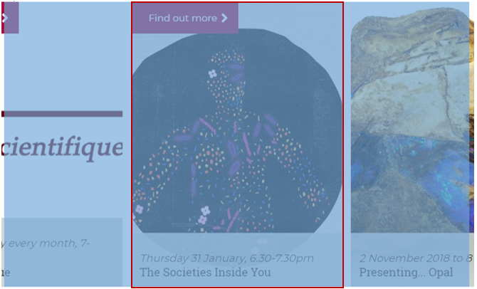
example image in grid

Fig. 3 Example of an image displaying in a Grid listing item


The blue overlay shows the initial crop size for images used in a Grid listing. The viewport (red frame) then reframes the image responsively, depending on the number of items per row. The cropped image is much wider than the portion of it that shows within the frame, allowing the responsive design to show more of it when fewer items per row fit on the page.

Tips for working with List Images

Applying the following tips will usually help to achieve a good result:

  • have the focal point of the image as close to the centre of the original as possible
  • show the less important part of the image to the left and right of the main part of the image and have sufficient space there for the reframing to find the centre of the image
  • use a larger original image which is more 'zoomed-out' than you would otherwise make it, so that the key part of the image is smaller within the overall size
  • use a large enough image: at least 1600 px wide for a Banner, or 800 px for a Grid or List image
  • use a landscape image
ideal focal point and framing area for a landscape image

Fig. 4 Image with focal point and area most likely to remain uncropped when viewed in a Grid listing

Certain combinations of item styles/widgets/nos. per row can be less than ideal for images that don't fit the optimal layout (especially when using Grids, where there are many options/contexts). If you need to use an image that does not fit this layout, there are some options:

  • select different configuration options, e.g. use 3 or 4 items per row rather than 6
  • select a different item style if there is an option that works better
  • instead of using a filtered or selected list, which uses the content's List Image, build the widget statically and use a separate version of the image optimised for the context where it will appear
  • accept that it won't look ideal in all locations


General considerations

Image dimensions: The image dimension limits are in place to help users manage the amount of disk space used by uploaded content, and thereby help users keep their sites within the Mosaic site size thresholds (which help determine the charging tier they occupy).

There are no limits on image dimensions for images uploaded via the Manage Content options because the intended use of the images is not defined at that point (unlike when images are uploaded via widgets).

Image quality: We do not have control over the quality of the rendered images. Any differences between the original image and the version appearing on the page is possibly due to the processing that Drupal performs on the image when it is compressed and resized to be responsive to changes in screen size. Image quality might also be affected by the browser's rendering process, which can vary between browsers.

Images containing text: We don't recommend that images containing text are used in banners or listings. This is because items will be resized depending on the screen size of the device the page is being viewed on. As items are resized, different parts of the image may be hidden or displayed. If you do want to use an image that contains text, we recommend some trial and error using text placed in a fairly central region of the image, and testing these images by resizing your browser window to simulate different device sizes (or viewing the page on different devices).