Widgets Overview

A widget is a small block of functionality which creates a specific piece of content on a page. There are 21 widgets in the Mosaic toolkit, divided into 6 categories. They can be used to create a variety of features on pages and in the site footer.

Widget category Widget Widget description
Authoring widgets What-You-See-Is-What-You-Get (WYSIWYG) content area A text editor, into which images and other media can be embedded
Accordion content Breaks text into collapsible sections
Tabbed content Breaks text into overlapping, tabbed sections
Advanced Authoring Advanced accordion Allows any widget(s) to be placed into collapsible page sections
Advanced tabbed content Allows any widget(s) to be placed into tabbed sections
Banner A large visual impact page element for displaying an image and text
Reusable content Creates a container for a widget(s) with a specific configuration to be reused in multiple parts of your site
Listings Grid A grid layout of items linking to other pages, which uses preset visual styles
List A list of items linking to other pages, which uses preset visual styles
Publications listing Displays publications for one or more Oxford users by drawing publications metadata from Symplectic Elements
Vacancy listing Displays job vacancies for University units by drawing data from the HR system
Galleries Carousel A side-scrolling set of items linking to other pages, which uses preset visual styles
Image gallery - Tiles  A set of square thumbnail images, which can be clicked on to open larger versions of the images in a lightbox
Image gallery - Featured Image A gallery with a large, scrolling preview panel and optional thumbnails
Slideshow advanced A large visual impact page element for displaying multiple panels containing images and text
Forms Webforms Available on request. Outputs an advanced webform on the page. Download a quick start guide.
Simple feedback form A form for web end users to submit one block of text and their email address
Other Metadata display Outputs the information entered into a page's metadata (e.g. Event date and location; Article author and publication date; Person affiliation and biography) on the page
Share on social media Displays Facebook, Twitter, and Email icons for web end users to share a link to the page across social media
Social media links Social media icons (using the free Font Awesome icon set) can be added to the page and linked to social media accounts
Taxonomy terms display Outputs the taxonomy terms (and, optionally, taxonomy names) associated with the page, for viewing by the web end user

Expand All

Widgets provide useful and attractive content for web end users. As a result, they're a key part of the editing process for pages and footers.

From a content editor's perspective, the editing process will often include:

  1. Choosing one of the 5 page/footer layouts
  2. Deciding which layout region to add a widget to
  3. Adding the widget to the page/footer region
  4. Configuring the widget using its editing options

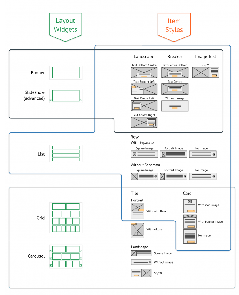
There are 5 widgets which use a set of pre-built styles to provide content with a visual impact:

  • Banner
  • Slideshow (advanced)
  • List listing
  • Grid listing
  • Carousel

Below is a schematic of the relationships between the visual impact widgets and the item styles available for each one.

Mosaic layout widgets and item styles schematic

To add a widget to a page region:

  • In a page's edit mode, navigate to the tab of the page Region you want to add the widget to
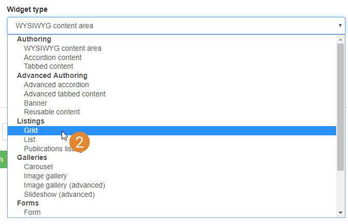
  • Click on the widget selector (1) to open the dropdown list
    add new widget interface
  • Select the widget you want to add (2)
    add new widget select list
  • Click 'Add new widget' (3)
    add selected widget
  • The widget's editing interface will load in the page Region tab. See information about widget editing below

Widget editing interface

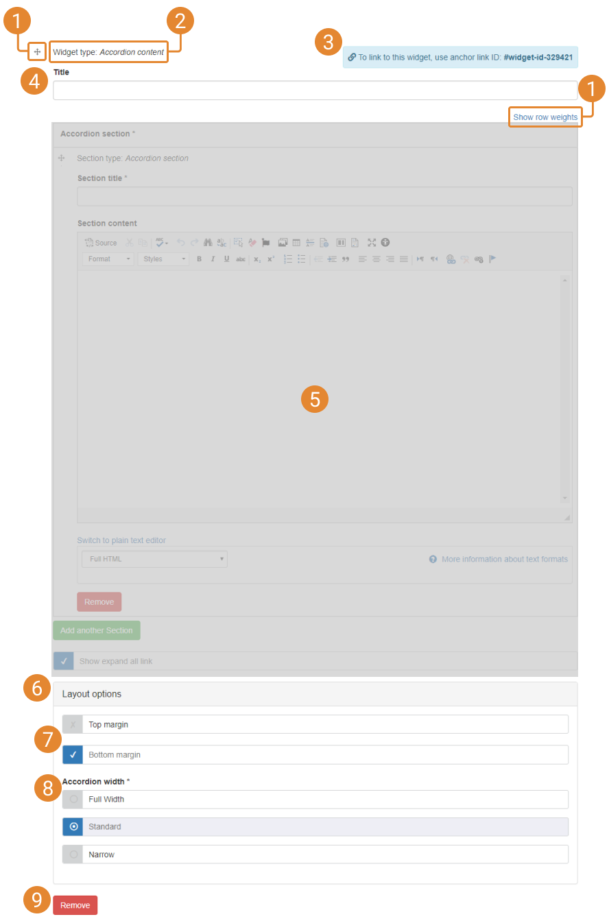
widget ui labelled
  1. Widget / item order: widgets can be ordered within page regions and items can be ordered within widgets (e.g. images in Image Galleries, statically-generated items in Grid listings). Two ordering methods are available - 'drag-and-drop' and 'row weighting'. Toggle between the ordering methods using the 'Show/Hide row weighting' link. 

    The weighting determines the order the items appear in, smallest value first to largest value last (the idea being that the 'lightest' items float to the top); you can edit the weighting values using the drop-down lists to change the order. Values do not need to be consecutive (e.g. you could have 5 items whose respective values are 1, 5, 10, 20, 50) and can be extended into negative numbers (e.g. if the current top item has a weighting of 0 you can add a new item with a weighting of -1 and it will appear above it).

    Once you save the edits, the changes will be rendered on the page; once you re-enter the widget edit mode, the sections will be displayed in their new order. 

  2. Widget type: refers to the type of widget
  3. Widget ID: when a new widget is saved to a page, a unique ID is created for it. This ID can be used to create a jump link (see the 'Anchors and Widget IDs' section of WYSIWYG documentation)
  4. Widget title: text input here will be displayed above the widget on the rendered page. Font configuration for widget titles exist in Advanced Font Management > Main Content
  5. Widget configuration options: each widget has configuration options. See the documentation for each widget for more details
  6. Layout options: margin and width options can be set for each widget
  7. Top / bottom margin: adds 16px margin to the top or bottom of the widget; bottom margin is on by default
  8. Widget width: see 'Widget widths' section below for details
  9. Remove widget: triggers widget removal process. See the 'Remove a widget' section below

Full page editing vs. Quickedit

Widgets can be edited via the full page edit screen (accessed by clicking the 'Edit page' link in a page's editing menu), or by using Quickedit.

Full page editing provides content editors access to all editing options.

Quickedit allows content editors to open the widget editing controls for individual widgets.

Pros and cons of Quickedit

  • Pros: Quickedit only loads the editing options for one widget at a time, and is sometimes quicker than opening the full page editing screen (particularly on pages which contain many widgets)
  • Cons: widgets cannot be moved to different regions or removed using Quickedit

Configuration options

Each widget is edited using a set of configuration options. There are three configuration options which are found in all widgets:

  • Title
  • Top margin (adds a 16px margin to the top of the widget)
  • Bottom margin (adds a 16px margin to the bottom of the widget) - this is switched on by default

All other configuration options are unique to each widget. See each widget's documentation page for specific information. See also the Mosaic Pattern Book for examples of visual impact widgets and their configuration options.

Collapsed view in the widget editing mode

When more than 3 widgets are present in a page region, their editing options are displayed in 'collapsed' view in the page editing screen.

Click 'Expand' to open the page editing controls.

To move a widget to another page/footer region:

  • Enter the full page editing mode
  • Go to the bottom of the editing options for the widget you want to move
  • Click on the selection box containing the text 'Move to a different region' to expand the list of options
  • Select the region you want to move the widget to
  • Click 'Move widget'
  • A browser alert will warn you that by moving a widget, the page will be saved as a new draft. Click 'OK' on the alert
  • When the page reloads, you will be viewing the new draft

To remove a widget from a page:

  • Click on the 'Remove' button at the bottom of the widget's editing options
  • The widget deletion process will run; once complete, a deletion confirmation message will be displayed
  • When the deletion confirmation message is displayed, click 'Confirm Deletion'

Widgets can be set to 3 different widths - full width; standard; narrow - using the configurations in the widget's Layout options.

Full width widgets...

Only recommended for use in full-width page regions. The amount of additional width the full width setting applies varies depending on which page region the widget is in.

...in full-width page regions

The widget width will increase from 1600px (maximum displayed width on desktop viewport sizes) to 1728px - i.e. 64px of width will be applied to each side of the widget.

...in non-full-width page regions

For widgets on the left-hand side of a page layout: 64px of additional width will be added to the left-side of the widget; 16px of additional width will be added to the right-side of the widget.

For widgets on the right-hand side of a page layout: 64px of additional width will be added to the right-side of the widget; 16px of additional width will be added to the left-side of the widget.

Standard width widgets

This is the default setting. The widget will appear at 100% of the width of its page region.

Narrow width widgets

The widget will appear at 66.67% of the width of its page region.